Anyone who designs and builds websites or mobile apps will have found themselves having to ensure their work is compatible with an ever expanding number of devices over the last few years, and it’s only going to keep expanding.
There are a number of different ways of testing compatibility on different devices, from just testing on a desktop and resizing your browser (not recommended) to software emulators, to buying real devices
We’re a firm believer in testing on real devices. Not because emulators don’t work, but because you only get the full experience when testing on a real device: Are the colours bright enough on an iPad in sunlight, are the buttons too small for my fat fingers on a small Android phone etc.
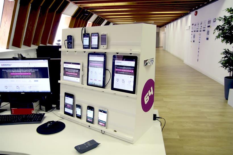
Having a large number of devices around the office can be a nightmare though. We’re constantly losing cables and chargers (and devices) and it takes ages to connect them up and test on them all. That’s why we built the 64 Digital Super Dooper Device Testing Station (name still up for debate).
Building it was pretty simple, we went to B&Q and bought some wood, constructed a cabinet with some thin shelves to put the devices on. We then used strips of Velcro above the shelves to allow us to fix the devices to the cabinet.
The next step was to drill some 30mm holes at intervals along the shelves so that we could pass all the cables through to the inside of the (most of them are small Micro USBs but the iPhones and iPads have silly proprietary connectors).
We fixed a couple of power strips inside the cabinet. These devices don’t draw much power so we were able to plug one into the other giving us a single power lead trailing from the cabinet which can easily be moved about and plugged in on anybody’s desk.
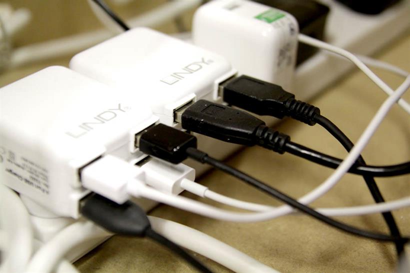
We also found some pretty cool 4 port USB plug adapters made by Lindy, which means we can plug up to 8 devices into 2 power sockets. Pretty neat
Now for the real time-saver. We use Adobe Shadow to synchronize all the devices so that they all show the site we’re working on. It’s a fantastic app for smartphones and tablets which connect to your PC over Wi-Fi and mirrors the page you’re looking at on every one of your devices without you having to keep pressing refresh.


So far we’ve got the following devices plugged in.
Google Nexus 7
Apple iPad 1 (not upgraded for testing on an older iOS)
Apple iPad 2
Apple iPhone 4S
Apple iPhone 3G
Samsung Galaxy S
Samsung Galaxy Note
HTC Desire HD
HTC Magic
Samsung Galaxy Nexus
Motorola Xoom
Blackberry Bold 9000
All of this means that when we’re building mobile websites or responsive websites, we can test it on all of these devices as we build, saving lots of time and ensuring maximum compatibility.
